|
New Site Design
|
|
| EmSeeD |
Date: Monday, 23/Jan/12, 3:28 AM | Message # 1 |

Heads
Posts: 11464
|
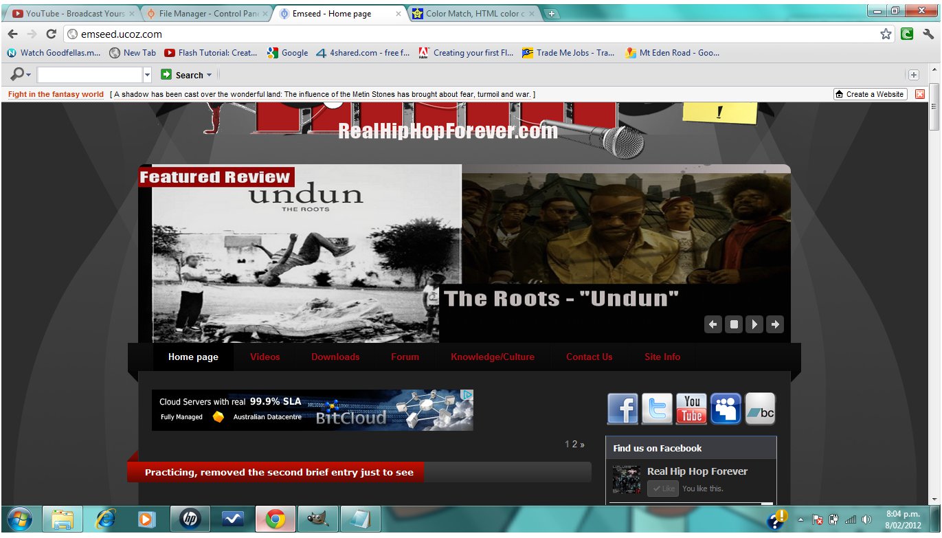
Testing this new design on here:
http://emseed.ucoz.com
http://emseed.ucoz.com/forum
Once its done and everyone's happy with it, I want to add it to this site
Its nowhere near finished yet, I'm aiming to finish it by the end of this week. But I need your guys feedback, if you think it looks better than this one or worse, or any critique you have to help make this design better
Let me know what features you want me to add to this new design
also if you're a good designer I could definitely use your help, I'm not the best at photoshop
I'm hoping we can start anew with this new design, and with the people who are left, we can all contribute and get this site heading in a better direction
Available for users only
Anyway check the design out and let me know what you think
Main Page: http://emseed.com
Forum: http://emseed.com/forum
http://chirbit.com/emseed
http://youtube.com/siwooot
|
|
|
|
| Greeny |
Date: Monday, 23/Jan/12, 10:32 AM | Message # 2 |

OGs
Posts: 1031
|
Later links are missing the ucoz part.
I like it the design a lot, the article titles look much better, I like it with tabs on top and the slide there is awesome.
:)
|
|
|
|
| Treach |
Date: Monday, 23/Jan/12, 2:52 PM | Message # 3 |

OGs
Posts: 1339
|
looks tight!
"We took pride in intellect and skill
Now you gotta have some sex appeal to get a record deal"
- K-RINO
|
|
|
|
| Convalesce |
Date: Monday, 06/Feb/12, 10:46 PM | Message # 4 |

Writers
Posts: 7
|
Everything looks a lot smoother. I like those, a lot.
"Going back and forth between the cigarette and her clitoris, working on both like it's no body's business."
|
|
|
|
| EmSeeD |
Date: Wednesday, 08/Feb/12, 3:07 AM | Message # 5 |
|
Heads
Posts: 11464
|
^ thanks for feedback bro
anyway which colour looks better on the menu? red or black? click on the images to see it in full size
Black:
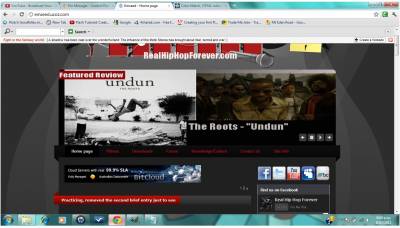
Red:

http://chirbit.com/emseed
http://youtube.com/siwooot
|
|
|
|
| Convalesce |
Date: Wednesday, 08/Feb/12, 3:54 AM | Message # 6 |
|
Writers
Posts: 7
|
Quote (EmSeeD) ^ thanks for feedback bro
anyway which colour looks better on the menu? red or black? click on the images to see it in full size
Black:
Red:
Imo. It can seriously go either way.
The red pops out at you, so you automatically know where to go. But the black is sleek. If you can add some sort of, "Glossy" look to it, it would look pimpin'.
But yeah, flip a coin, 'cause they both look good 
"Going back and forth between the cigarette and her clitoris, working on both like it's no body's business."
|
|
|
|
| Greeny |
Date: Wednesday, 08/Feb/12, 4:19 AM | Message # 7 |
|
OGs
Posts: 1031
|
I don't like black text over red background, at least not with that font... White over red looks better, but you're using that for article titles lower down, so idk... I like it better red though.
:)
|
|
|
|
| EmSeeD |
Date: Thursday, 09/Feb/12, 5:40 AM | Message # 8 |
|
Heads
Posts: 11464
|
you and chinita both like the red, so i put the red up, check out how it looks, also made it white words over red
ratmn said he doesn't like the fonts, so i guess i'll have to see about that at some point
http://chirbit.com/emseed
http://youtube.com/siwooot
|
|
|
|
| Greeny |
Date: Thursday, 09/Feb/12, 11:47 AM | Message # 9 |
|
OGs
Posts: 1031
|
Looks good. It's getting a bit messy though with all the social networks, facebook thingy and chatango all wrapped up around each other... Not sure what could be done to prevent it though.
Also, shouldn't the log in form be further up?
:)
|
|
|
|
| eboyd |
Date: Thursday, 09/Feb/12, 6:06 PM | Message # 10 |

Heads
Posts: 13145
|
i like the red too. how much longer till you think it's ready to put up?
my new theme song
erikboyd60@hotmail.com
"True poetry can communicate before it is understood"
-T.S. Eliot
battle record:
7-0-0

|
|
|
|
| EmSeeD |
Date: Friday, 10/Feb/12, 5:28 PM | Message # 11 |
|
Heads
Posts: 11464
|
Quote (Greeny) Looks good. It's getting a bit messy though with all the social networks, facebook thingy and chatango all wrapped up around each other... Not sure what could be done to prevent it though.
Also, shouldn't the log in form be further up?
yeah i'm gonna take off that bandcamp one, i don't know what you mean by the facebook thing and the chatango wrapped around each other though
you're right about the log in form too
i don't know when it will be ready but i will be working on it a lot now today
http://chirbit.com/emseed
http://youtube.com/siwooot
|
|
|
|
| s0dr2 |
Date: Saturday, 11/Feb/12, 11:46 AM | Message # 12 |

OGs
Posts: 2772
|
go go go!!
"Twenty years from now you will be more disappointed by the things that you didn't do than by the ones you did do. So throw off the bowlines. Sail away from the safe harbour. Catch the trade winds in your sails. Explore. Dream. Discover." - Mark Twain

|
|
|
|
| EmSeeD |
Date: Saturday, 11/Feb/12, 5:51 PM | Message # 13 |
|
Heads
Posts: 11464
|
before we can put this new design on, we need a review for an album written, anyone keen on doing the first review?
http://chirbit.com/emseed
http://youtube.com/siwooot
|
|
|
|
| EmSeeD |
Date: Sunday, 12/Feb/12, 0:46 AM | Message # 14 |
|
Heads
Posts: 11464
|
okay unless people can see other things that can be fixed, this site is nearly nearly ready, there's a couple other things i want to try and add but I can add those after we switch over. But one of us needs to write a review, if noone does then i'm gonna have to do it and that will stall this design being switched over.
http://chirbit.com/emseed
http://youtube.com/siwooot
|
|
|
|
| Greeny |
Date: Tuesday, 14/Feb/12, 9:39 AM | Message # 15 |
|
OGs
Posts: 1031
|
Quote (EmSeeD) before we can put this new design on, we need a review for an album written, anyone keen on doing the first review?
Sure. What for though?
:)
|
|
|
|