|
New Header and Background?
|
|
| Greeny |
Date: Saturday, 28/Jul/12, 6:52 PM | Message # 31 |

OGs
Posts: 1031
|
A header doesn't need to be perfect on details, it just needs the big picture stuff right, because most people will just glance at it, a few will look closer, but not for more than like 5 seconds. Honestly, I can hardly picture Youtube's logo.
I think the older one had that general good look going while the other one was rather boring and didn't really put a blimp on my radar - per se :]
:)
|
|
|
|
| Chinita |
Date: Wednesday, 01/Aug/12, 9:04 AM | Message # 32 |

Heads
Posts: 5823
|
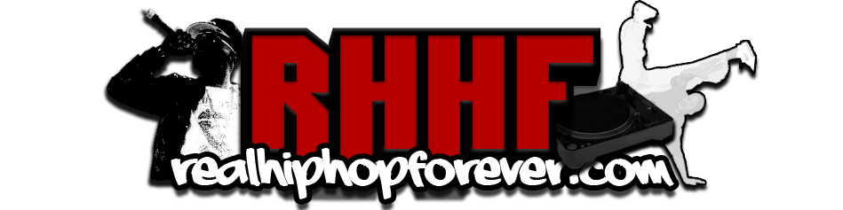
i think the one we have, is straight to the point, it has our rhhf url, the mic, the bboy, a record with the hand for our dj and the no wackness falls into place with what rhhf stands for..i think its pretty simple, makes a point...if we find something better than that, hit me up and i'll check it out, i just think for now this one is still the dopess and shows all the elements~

|
|
|
|
| Chinita |
Date: Wednesday, 01/Aug/12, 9:13 AM | Message # 33 |
|
Heads
Posts: 5823
|
adam what do u mean its choppy
well if you guys can add the bboy, that mic and maybe make it a bit wider, bigger, thicker. i think the rhhf is very small, it didnt look right on the main page over everything else, its was missing something..see if you can add the wackness, but put it on the practice site..i do like the spinning record but there is so much missing, its nothing interesting to it except that record, the rhhf font is nice but the main page over powers it, its small, not big bold letters as the other one is.
when i first saw it that new header, my first impression was that everything else looked over powering, it did not stand out or look attractive, the header is still the first thing people see, even if they see it once, it stands for who we are, its that first impression people get hit with. and first impressions count, straight to the point. its like a job interview, u only get that once chance..people judge a book by its cover..that is our cover.
|
|
|
|
| Adam |
Date: Wednesday, 01/Aug/12, 11:14 AM | Message # 34 |

B-Girls
Posts: 3794
|
It is clipping in many areas, like the arrows and the post-it note itself is rough and choppy.
I JUST EXPLODED INTO RAINBOWS AND LOLLIPOPS!
|
|
|
|
| NtG |
Date: Wednesday, 01/Aug/12, 12:21 PM | Message # 35 |

Heads
Posts: 4047
|
I'll make one after I eat lunch, and you guys can tell me what you think
[deleted]
|
|
|
|
| NtG |
Date: Wednesday, 01/Aug/12, 4:55 PM | Message # 36 |
|
Heads
Posts: 4047
|
Here is what I have so far, I don't really know what things you want me to add (turntable? bboy? mic? etc.) so please hit me up with suggestions.

I think i'm gonna change the white outline on "RHHF", also apparently I forgot to erase that white spot in the top left corner lol
EDIT: Update:

[deleted]
|
|
|
|
| EmSeeD |
Date: Thursday, 02/Aug/12, 2:39 AM | Message # 37 |

Heads
Posts: 11464
|
I put the second one on the test site
http://emseed.ucoz.com
I like the second one better. Its hard to me too tell right now which is better, think i'll have to give it some time to get used to
(btw the only reason i made that new test site is coz the bodescu one wasn't working)
http://chirbit.com/emseed
http://youtube.com/siwooot
|
|
|
|
| EmSeeD |
Date: Friday, 03/Aug/12, 2:08 AM | Message # 38 |
|
Heads
Posts: 11464
|
well what do you think of how it looks on that site then?
http://chirbit.com/emseed
http://youtube.com/siwooot
|
|
|
|
| NtG |
Date: Friday, 03/Aug/12, 10:06 AM | Message # 39 |
|
Heads
Posts: 4047
|
I think it looks alright, but it needs some more stuff going on. It's too plain right now. I just don't have any ideas as to what I should put on it.
[deleted]
|
|
|
|
| Greeny |
Date: Friday, 03/Aug/12, 4:16 PM | Message # 40 |
|
OGs
Posts: 1031
|
Having the URL on it is kinda redundant though, isn't it? People will have to use the URL to see it in the first place...
I like the first of NTG's ones, the one with white, looks like the GTA font. Got more details and shit. Depth inside a 3D lettering looks a bit weird though.
:)
|
|
|
|
| Greeny |
Date: Friday, 03/Aug/12, 4:18 PM | Message # 41 |
|
OGs
Posts: 1031
|
Quote (Adam) It is clipping in many areas, like the arrows and the post-it note itself is rough and choppy.
It is.. Don't think people notice it though. It's not as clean as it could be. Looks like it was stretched from a smaller format.
The pixels are all wrong, man!
:)
|
|
|
|
| Chinita |
Date: Friday, 03/Aug/12, 4:56 PM | Message # 42 |
|
Heads
Posts: 5823
|
thats kinda nice on the practice site, like emseed said, i have to get use to it but i think it would be quick....ntg yeah maybe try adding the bboy, record, mic..i'm liking both first and that second... luv the realhiphopforever url as well, it stands out nice..being that we have the ucoz that pops up in people address bar....
|
|
|
|
| NtG |
Date: Friday, 03/Aug/12, 8:25 PM | Message # 43 |
|
Heads
Posts: 4047
|
I still gotta add a little bit of effects, and I was thinking about having stars shooting out of the sides too. Heres a preview of what i got so far.
[deleted]
|
|
|
|
| EmSeeD |
Date: Friday, 03/Aug/12, 8:50 PM | Message # 44 |
|
Heads
Posts: 11464
|
Quote (Greeny) I like the first of NTG's ones, the one with white, looks like the GTA font. Got more details and shit. Depth inside a 3D lettering looks a bit weird though.
I thought the same thing but when I tried it on the test site, the second one looked way better
that new one is looking dope, i put it on the test site
http://chirbit.com/emseed
http://youtube.com/siwooot
|
|
|
|
| Adam |
Date: Friday, 03/Aug/12, 10:25 PM | Message # 45 |
|
B-Girls
Posts: 3794
|
dope... I am offended. This mediocrity will not be tolerated.
I JUST EXPLODED INTO RAINBOWS AND LOLLIPOPS!
|
|
|
|


