|
New Header and Background?
|
|
| EmSeeD |
Date: Saturday, 04/Aug/12, 7:21 PM | Message # 46 |

Heads
Posts: 11464
|
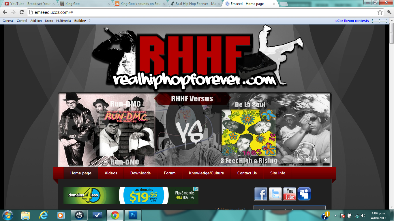
I think it would look cool with stars or some effects like that, i think it definitely looks better than the one we have now though.
(Click on the images btw, they look like bad quality but when you click on them you see what they really look like)


http://chirbit.com/emseed
http://youtube.com/siwooot
|
|
|
|
| Treach |
Date: Sunday, 05/Aug/12, 3:47 AM | Message # 47 |

OGs
Posts: 1339
|
tightt
"We took pride in intellect and skill
Now you gotta have some sex appeal to get a record deal"
- K-RINO
|
|
|
|
| Greeny |
Date: Sunday, 05/Aug/12, 7:14 AM | Message # 48 |

OGs
Posts: 1031
|
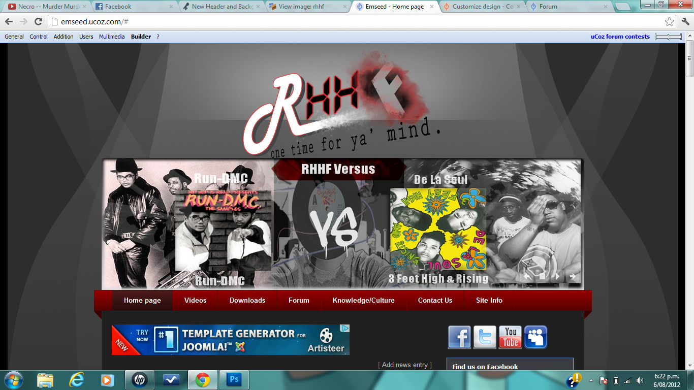
Awesome. Second is better.
:)
|
|
|
|
| Adam |
Date: Sunday, 05/Aug/12, 1:14 PM | Message # 49 |

B-Girls
Posts: 3794
|
Wtf? the thick borders of ntg's header completely throws off the look of the rest of the sites template. Notice how there aren't even borders at all in the sites template. This makes the black in ntg's header way too heavy. Also the bg pattern with the gray light ray looking things is really just terrible. It fights with everything and makes the site look so disconnected.
idk if this would fit at all but

I JUST EXPLODED INTO RAINBOWS AND LOLLIPOPS!
Message edited by Adam - Sunday, 05/Aug/12, 2:01 PM
|
|
|
|
| NtG |
Date: Sunday, 05/Aug/12, 4:45 PM | Message # 50 |

Heads
Posts: 4047
|
Quote (Adam) Also the bg pattern with the gray light ray looking things is really just terrible. It fights with everything and makes the site look so disconnected.
Agree, that's why this thread is called "New Header AND BACKGROUND"
Anyways, heres a little something I added, I'm not too sure about it tho, might try putting stars in and removing the paint.

[deleted]
|
|
|
|
| Adam |
Date: Sunday, 05/Aug/12, 5:41 PM | Message # 51 |
|
B-Girls
Posts: 3794
|
yeah but emseed never changes the bg to anything I suggest....
I JUST EXPLODED INTO RAINBOWS AND LOLLIPOPS!
|
|
|
|
| EmSeeD |
Date: Monday, 06/Aug/12, 2:15 AM | Message # 52 |
|
Heads
Posts: 11464
|
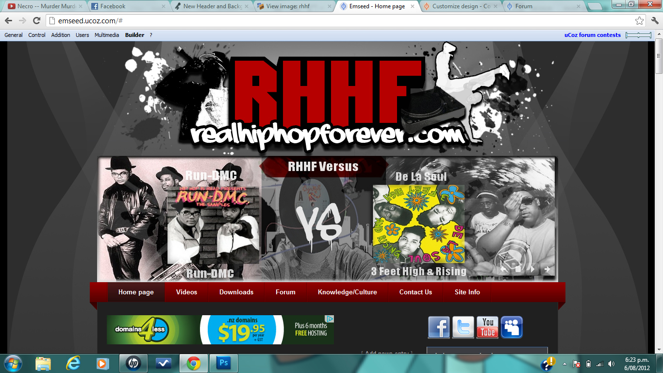
man they both look good, idk about you guys but adams images don't show up for me so i have to copy the link
http://s14.postimage.org/9kotonh1b/rhhf.png
i'll try both of them now
Quote (Adam) yeah but emseed never changes the bg to anything I suggest....
i did but they didn't like it
http://chirbit.com/emseed
http://youtube.com/siwooot
|
|
|
|
| NtG |
Date: Monday, 06/Aug/12, 6:04 PM | Message # 53 |
|
Heads
Posts: 4047
|
 
[deleted]
|
|
|
|
| EmSeeD |
Date: Tuesday, 07/Aug/12, 2:23 AM | Message # 54 |
|
Heads
Posts: 11464
|

http://chirbit.com/emseed
http://youtube.com/siwooot
|
|
|
|
| Adam |
Date: Tuesday, 07/Aug/12, 2:04 PM | Message # 55 |
|
B-Girls
Posts: 3794
|

I JUST EXPLODED INTO RAINBOWS AND LOLLIPOPS!
|
|
|
|
| NtG |
Date: Tuesday, 07/Aug/12, 2:11 PM | Message # 56 |
|
Heads
Posts: 4047
|
lol^ just stop bro
[deleted]
|
|
|
|
| Adam |
Date: Tuesday, 07/Aug/12, 2:47 PM | Message # 57 |
|
B-Girls
Posts: 3794
|
Wha? I'm not the one using cheap as splatter brushes.
I JUST EXPLODED INTO RAINBOWS AND LOLLIPOPS!
|
|
|
|
| Greeny |
Date: Tuesday, 07/Aug/12, 3:54 PM | Message # 58 |
|
OGs
Posts: 1031
|
I don't see the image you posted.
:)
|
|
|
|
| Greeny |
Date: Tuesday, 07/Aug/12, 3:54 PM | Message # 59 |
|
OGs
Posts: 1031
|
Can't see it as a matter of fact.
:)
|
|
|
|
| EmSeeD |
Date: Wednesday, 08/Aug/12, 3:04 AM | Message # 60 |
|
Heads
Posts: 11464
|
Quote (Greeny) I don't see the image you posted.
for some reason the site he uses doesn't work, but just copy the image link from it
http://s12.postimage.org/8k90rp8vf/Untitled_1.gif
I like adams, but don't like the way it touches that slider on the site, so far i'm liking ntg's one coz it fits the site more. Even though adam's might be more better technically or w/e, i'll try that new one adam did to see what it looks like
Just tried adam's new one, for that one to work i think we'd need a different background coz that shelf doesn't fit the background at all. I think we should just go with ntg's header
http://chirbit.com/emseed
http://youtube.com/siwooot
|
|
|
|