|
Ready To Die Album Cover...
|
|
| Joker13 |
Date: Friday, 03/Sep/10, 4:03 PM | Message # 1 |

Emcees
Posts: 391
|
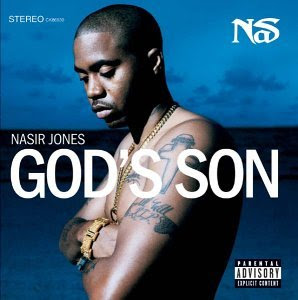
I was going through my album collection and i found a salsa gem as i was looking at the cover i pulled out ready to die and then laughed did biggie really bite nas... or did he bite a salsa album... 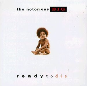

....
|
|
|
|
| Lord_Meth |
Date: Friday, 03/Sep/10, 4:08 PM | Message # 2 |

Heads
Posts: 6627
|
HAHAHAHA! Good find there Joker.
Sick With It
|
|
|
|
| Joker13 |
Date: Friday, 03/Sep/10, 4:12 PM | Message # 3 |
|
Emcees
Posts: 391
|
LOL! thanks I think it's time for someone in biggies camp to give respect to these guys -__-
....
|
|
|
|
| Treach |
Date: Friday, 03/Sep/10, 5:37 PM | Message # 4 |

OGs
Posts: 1339
|
lol...no matter what cover you have it will still resemble another one
"We took pride in intellect and skill
Now you gotta have some sex appeal to get a record deal"
- K-RINO
|
|
|
|
| ThaScience |
Date: Friday, 03/Sep/10, 5:59 PM | Message # 5 |

OGs
Posts: 1160
|
take a close look at the format of the writing, all of it. and tell me who he bit.

|
|
|
|
| EmSeeD |
Date: Friday, 03/Sep/10, 6:34 PM | Message # 6 |

Heads
Posts: 11464
|
whoaaaa you just blew my mind reminds me of this one, came out around the same time too i remember my auntie had this on cassette 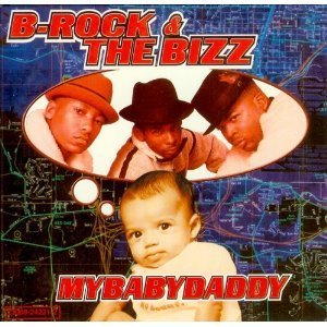
http://chirbit.com/emseed
http://youtube.com/siwooot
|
|
|
|
| Adam |
Date: Friday, 03/Sep/10, 6:36 PM | Message # 7 |

B-Girls
Posts: 3794
|
Thescience is speaking truth... look at the text, he bit nas, but that cover is pretty similar.
I JUST EXPLODED INTO RAINBOWS AND LOLLIPOPS!
|
|
|
|
| EmSeeD |
Date: Friday, 03/Sep/10, 6:40 PM | Message # 8 |
|
Heads
Posts: 11464
|
Quote (Adam) look at the text, he bit nas, but that cover is pretty similar. the texts aren't close in the slightest
http://chirbit.com/emseed
http://youtube.com/siwooot
|
|
|
|
| Adam |
Date: Friday, 03/Sep/10, 6:47 PM | Message # 9 |
|
B-Girls
Posts: 3794
|
uhh dude.... you can't say they are not close at all....
 notice how on biggies cover the bottom text says "ready to die" all lowercased with die being red, and "ready to," being bolded and off compared to "die." Then look at illmatic It says "illmatic" but the "ill" part is off and the style is off as well. Heres a big one. The top text on ready to die says the notorious BIG. With the "BIG" red and boxed in black. Just like "NaS" on illmatic red with a black outline.
I JUST EXPLODED INTO RAINBOWS AND LOLLIPOPS!
|
|
|
|
| EmSeeD |
Date: Friday, 03/Sep/10, 7:25 PM | Message # 10 |
|
Heads
Posts: 11464
|
all album covers and posters do that to draw your eye down at and angle across the cover, they'll have something to make one of the top corners stand out and then have something on the opposite lower corner to draw your eye down in that direction, its a very common format. the word "big" and the word "Nas" are both totally different as well, different sizes, different fonts. them both being red and having a black outline is because of the color theme they chose, not because they were biting the cover. the color theme for biggies album was red, white and black. so of course they're going to make the top corner stand out by having a word in red, red is the first color your eye sees, (you probably looked at the red title on the album cover below before you read this) red automatically attracts your eye to the image, this is why the color them of red, white and black is very common in design. and if you want to get picky the word "nas" is in a different type of red then the one used in biggies cover. go search "album cover" in google and you'll see for yourself 


 the only one who bit nas album cover is this guy, theres no question this is biting 
http://chirbit.com/emseed
http://youtube.com/siwooot
|
|
|
|
| Adam |
Date: Friday, 03/Sep/10, 7:32 PM | Message # 11 |
|
B-Girls
Posts: 3794
|
Woah ok sir. All I said was that they weren't polar opposites. But they got themselves as a baby so he did bite nas.
I JUST EXPLODED INTO RAINBOWS AND LOLLIPOPS!
|
|
|
|
| ThaScience |
Date: Friday, 03/Sep/10, 8:39 PM | Message # 12 |
|
OGs
Posts: 1160
|
Quote (EmSeeD) the word "big" and the word "Nas" are both totally different as well, different sizes, different fonts. them both being red and having a black outline is because of the color theme they chose, not because they were biting the cover. the color theme for biggies album was red, white and black. so of course they're going to make the top corner stand out by having a word in red, red is the first color your eye sees, (you probably looked at the red title on the album cover below before you read this) red automatically attracts your eye to the image, this is why the color them of red, white and black is very common in design. and if you want to get picky the word "nas" is in a different type of red then the one used in biggies cover. http://www.youtube.com/watch?v=C6YfJZ9hxLQ
|
|
|
|
| ThaScience |
Date: Friday, 03/Sep/10, 8:42 PM | Message # 13 |
|
OGs
Posts: 1160
|
nov 2002
 dec 2002
|
|
|
|
| Lord_Meth |
Date: Friday, 03/Sep/10, 9:40 PM | Message # 14 |
|
Heads
Posts: 6627
|
I dont really see wats so wrong with taking inspiration from other covers.
In computer graphics at school, we take inspiration from other shit all the time. Except we put our own
twist to it so it wont be 100% like the original.
Sick With It
|
|
|
|
| Adam |
Date: Friday, 03/Sep/10, 9:46 PM | Message # 15 |
|
B-Girls
Posts: 3794
|
I hate web design classes... they don't let you do your own thing...
I JUST EXPLODED INTO RAINBOWS AND LOLLIPOPS!
|
|
|
|


